
“How much should I pay to make my website attractive?” – this question is probably #1 on the checklist for creating any website. The truth is that there’s no definite price or collection of plugins which will make a passer-by stay on your website forever. It’s a common fact that the book is judged by its cover, that’s why the first impression matters so much, and define all the following “relationships” between a website and a visitor. If you are running a website but have an inner feeling that it can look better, keep on reading and learn what are simple ways to improve website’s usability by “putting a few tints of make-up” on the layout.
The below ideas are not must-followed ones, and they won’t guarantee you tremendous success or profit, but if followed carefully, they will definitely make any website look unique and, in the long run, professional and trustworthy.
Brand Speaks Volumes
1. Make a neat and professional logo. This is the very first element a visitor meets when comes to your website. Make sure it contains your product/service name and is done in your company colors.
2. Create a website favicon. It’s the square icon which you can see in the address bar of your browser. Well-designed favicons should match the logo or a theme of a web project to provide a visitor the ability to recognize your website at a glance.

3. Create your custom blog post feature image. This is the one spread on Twitter, Facebook, LinkedIn and other social networks. Having your own “handwriting” in choosing images for posts, a user develops some associations and identifies the posts written by you from the first sight.
4. Stick to one color scheme and use it throughout the whole website. Choose 2-3 basic colors and your website will look stylish and not obsessive at the same time. Newer use black, cause it always adds a dark shade to your website. Avoid neutral grey, as far as it deprives your website a personality. You’d better add a hue of red, blue or yellow and your web creation will get a fresh coat of paint.
Type with Your Voice
5. It’s said that almost 90% of the website is typography. That’s why to make a good impression on the first-time visitor, define your leading font and use it for the majority of the text. Do not use more than three font types, cause it looks messy and slows your website down. Choose the heading, the paragraph prints and one more for special cases.
6. Use typographical elements to make your posts visually attractive and structured. Here go bulleted and numbered lists, captions, highlighted texts, abbreviations and quotes.
7. Every website has elements which appear rather often. It can be social media logos, interactive graphics, navigation buttons and so on. Instead of using ordinary images, install a custom icon font which gives your website pro-looking savor.
Social Media Integration
8. Personally, I haven’t met a website which does not use social media for its promotion and working altogether. And this practice is even welcomed if used properly. Do not over limit the number of social media buttons on your website pages, cause this will add extra load time to it. 1-5 icons will be quite enough to inform your readers about main social media channels (e.g., Facebook, Twitter, LinkedIn, Instagram, Pinterest), won’t be?
9. Establish social media graphics for your Twitter, Facebook and other SM channels. This will make an immediate positive impression on your audience and will inspire them to follow, like and even share your website content.
Content Is Above All
10. Do you know wh![]() at is the most visited page on any website? These are homepage and about page. So. make sure they describe your company or product in the best light.
at is the most visited page on any website? These are homepage and about page. So. make sure they describe your company or product in the best light.
11. You also need to create a landing page on your website if you want users to take some specific actions. Don’t forget to adjust it to the general outlook of your website (colors, icons, fonts, etc.)
12. Selling products? Make sure you have a good-looking sales page, with a catchy headline, short sales video and your customers’ feedbacks. Use the bottom of the selling page to direct people to purchase. This won’t look like pure ads but will be a good navigator for your clients.
Meet the First Violin – Security
13. SSL (Security Sockets Layer) certificate is here to establish the secure and encrypted connection between your website and the internet browser. Most checkout software demands an SSL certificate if you’re accepting credit cards. Moreover, according to Google, this certificate improves your SEO.
14. Keep on plugins and software updating. When your CMS platform has announced the upcoming update, take your time to move to the latest version, otherwise, the website might be hacked.
15. Double authentication login gate for your admin page is the wisest decision when it comes to the website security.
16. The default admin username is “admin”. Never, I say, never leave it this way. You’d better delete the default admin account and create the new one with the totally different username.
17. A regular backup will help you to restore all the files in case you lose your website. “I’m keeping an eye on my website” – you may say, but, believe me, if you are on your way to improving the website, sooner or later there will appear those jealous hackers who will cross all your job. Forewarned is forearmed, isn’t it?
Page Speed Is Crucial
18. Bear in mind “the rule of 2MB”. This means that any page weighing more than 2 MB is too heavy for your website and it will take years for a user to get the info he/she was looking for.
19. Use CSS to show such page elements as button, form, etc. instead of background images. Cascading Style Sheets or CSS loads faster and is more flexible in responsible layouts.
20. Optimize your images before uploading to the website. There are lots of great online tools, e.g., TinyPNG, which reduce the image size but don’t harm the image quality and resolution.
21. Establish the browser caching by setting due-date for pages that are not regularly updated. It will save the space on your website and increase the loading speed.
It’s All About SEO
22. One keyword per one page. This is the ideal formula for SEO ranking. Focus on optimizing that page for the keyword, but be careful, because too much is never good.
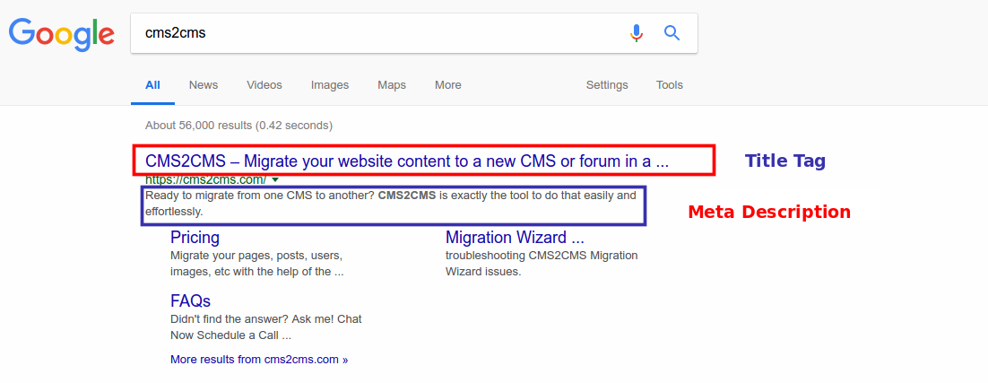
23. Use title tags with the keywords, you’ve chosen, included. It displays as the blue link in Google search results. To meet all the Google’s requirements, limit the title tag to 55 characters.
24. Meta description is another welcomed by Google element. It is displayed as a short summary of the page under the link. Be sure you set it on every page and include keyword phrase as well.
25. Use Google Analytics to make sure that your website is loved by people. This will also help you define your website’s weak and strong sides, and will show what has to be improved.
User Interface Is What Really Matters
26. Every page is created for some particular purpose. Use big and readable call-to-actions in order to show a user the most important message. The best way to design call-to-action is giving them button look.
27. Change the colors of the visited links, so that the visitors will see that they’ve already been to that page.
28. Provide current year in the copyright footer area. This will prove that your site is up-to-date and there won’t be a shade of question whether the service/product you are offering is available or not.
29. It’s not a secret that fewer and fewer people are accessing the net via laptops. Moreover, it’s said that 61% of users are unlikely to return to a website after having a negative mobile experience. Thus, make sure that your website is mobile-friendly and responsive on any digital device. If a website is properly mobile-optimized, it automatically loads faster, is higher ranked by Google and users as well.
Development
30. Create a custom plugin to give unique functionality to your website. I know it’s not so easy to maintain, but it will guarantee your website an enormous advantage over all your competitors together.
31. Try to avoid manual work as often as it’s ever possible. You’ve created a website, that’s quite enough! Let the tools and automated services do all the preceding job. Forming a menu, checking the broken links and even the website migration, all these can be done in a fully automated way.
32. Test your website for cross-browser compatibility to be sure that it is displayed in different browsers properly. You never know what web portal Chrome, Firefox, Safari or Internet Explorer your visitor has resorted to.
33. Not all the changes are good, right? For this scenario, it’s ideal to have a staging environment where you can test the adjustments you’ve made. Once you are satisfied with all the changes, push the staging to the production website.
These were just a few basic suggestions for the website improvements, a drop in the ocean, you know. If you have a word or two to be added to the above list of ideas, feel free to share them in the comments section. Let’s make the web functioning and look more attractive together!